Dynamic Placement Test
Role
UI Designer
Deliverable
Responsive Mobile App
Timeline
6 Months
Platform
Adobe creative suite
Dynamic Placement Test is created to help institutions or schools do the adaptive test that classifies their candidates based on their English level. The test takes approximately 30 minutes to complete, and the questions are randomised.
I was honoured to participate as a UI and branding designer. I’ve made prototypes, and visual designs and followed up the implementation.
Background
The Dynamic Placement Test team regularly runs data analysis on tests taken by users, allowing us to renew and refresh the questions. With the constant of data from thousands of test takers we are also able to look at the validity of every item, ensuring it helps determine a test taker’s CEFR level within the 30 minute time-span. This means the test will become ever more relevant, reliable and valid.
Logo Concept
The inspiration of the logo came from the vocabulary 'placement' and playground runway. So, I picked the 'P' to be the main image and the lines represent the classified function of the app.

Design System
Because of 'TEST', the interface should be concise and consistency in different device, it is for the fairness and reliability
Colour Theme
Red and blue is popular using in academic industry. However, it is a revolution that doing a test by using mobile and it is cross device. So, I choose to use a 'fresh and growth' mood colour to present the different between other apps. Also try to use the gradient on the app that create a complementary look on the app. It also match the name of the app 'dynamic'.
Typography
Since it is created for test, the rule of typography choosing should be readable and clear. I choose 'Helvetica Neue' because it match what I want.

Button & Structure
“Consistency is one of the most powerful usability principles: when things always behave the same, users don’t have to worry about what will happen.” — Jakob Nielsen
I design the buttons with consistency; and each question with 'capsule', make candidates can be more easy to read it.

Graphic
Consistency is one of the most powerful usability principles: when things always behave the same, users don’t have to worry about what will happen.” — Jakob Nielsen
I design the buttons with consistency; and each question with 'capsule', make candidates can be more easy to read it.

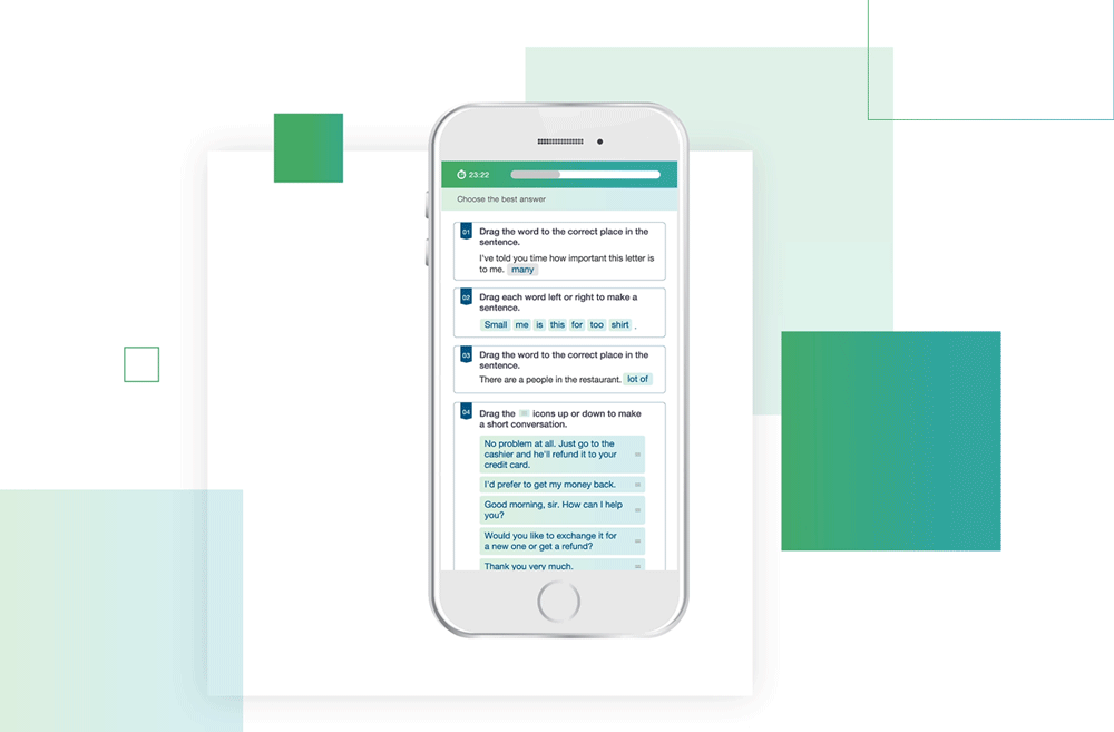
Question type
Beside multiple choice questions, it also includes other questions types, such as listening, true and false, proof-reading. I keep it simple, consistency and concise.

Responsive Design
This is designed for 'fair' because the app is for 'test'. I hope to make the interface look consistency. So that can be fair for candidates ,no matter what devices they use.

Demo
I have created an animation for showing how the test work.