Tense Buster
Role
Concept, Research, Visuals
Project type
UX Research, UI Design, Marketing Promotion
Duration
02 September 2015 to 03 July 2016
Tense Buster is an old english learning program that create since 1992. It installed by CD and the learners was around the world. Mostly, they are the school students.
This project is to re-design the program to improve the interfaces and the user experiences to be more user friendly and fit into different (up to date) devices - mobile, tablet and desktop.
Responsive Design
To redesign it, I try to re-arrange the elements in the different device interface. For example: the question of the exercise is very long. The question bar on top can be fully showing on desktop and tablet, but on mobile, if showing the full sentence, it will affect the experience, I make an arrow on right for showing the full question sentence. So that if users finish reading it, they can close it.
And for the menu, I try to sync the interface layout to be similar, so that the user no need to hesitate when using different device.


Exercise Layout
Here are the exercise interface, Listening/Fill in the blank/Multiple choice/True or false,
I try to arrange the space be useful and reduce the wasting space.

Life is too hard without a design system
I try to use a readable fonts and keep the colour for separate different chapter.
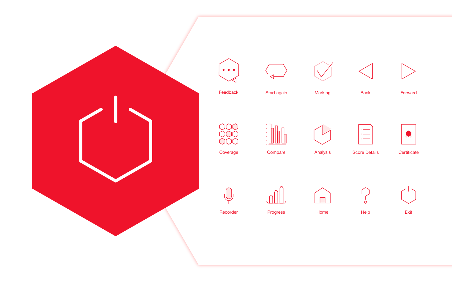
Icon design is one of the element to present the branding. I create the icon for fitting the app programme.
The .gif is show the 'clicked' effect.

Layout Comparison
There are also some different between different device because the limitation and user habits; and I would like user feel comfortable when using them. Let's take the progress page to be an example.
Because of the usage are different, I design the classic bottom navigation bar for mobile. This design matches the one-handed operation habits of mobile phone users.


